App UI design is critical to mobile app success. It’s more than just aesthetics; it’s about creating intuitive, user-friendly interfaces that seamlessly guide users through their experience. This guide explores the essential principles and techniques for crafting effective app interfaces, from user research to design tools, and accessibility considerations. We’ll delve into the core elements of a compelling app UI and how to effectively apply these concepts.
This exploration of app UI design covers a broad spectrum of topics. We’ll discuss user research methodologies, the crucial role of UI design principles like usability and accessibility, and the importance of a user-centered approach. The practical aspects of implementing these principles through UI elements, components, and design tools will also be highlighted.
Introduction to App UI Design
App UI design is the process of creating the visual elements and interactive components of a mobile application. Its purpose is to ensure a seamless and enjoyable user experience. Effective UI design is crucial for mobile app success, driving user engagement, satisfaction, and ultimately, app adoption. A well-designed interface guides users intuitively through the app’s features, making it easy to accomplish tasks and discover new functionalities.
A strong UI design fosters user trust and encourages repeat use. It significantly impacts user acquisition and retention rates, contributing to the overall success of the application in the market. This attention to detail in the user interface is essential for creating a positive first impression and encouraging continued engagement.
Key Principles and Best Practices
Effective UI design adheres to several core principles to optimize user experience. These principles, when applied correctly, lead to an intuitive and engaging interface. Prioritization, consistency, and clarity are key components of these best practices.
- Prioritization: Organizing elements based on their importance and frequency of use is critical. High-priority elements should be prominently displayed, while less frequent interactions are relegated to less prominent locations. This allows users to quickly locate the most important aspects of the application.
- Consistency: Maintaining a consistent visual style and interaction patterns throughout the application is vital. This reduces cognitive load for the user and allows them to easily navigate and understand different sections of the app.
- Clarity: The UI should clearly communicate the purpose and function of each element. Using clear language, concise labels, and intuitive interactions is paramount for a positive user experience.
Role of Visual Elements
Visual hierarchy, typography, and color palettes significantly impact the user experience. These elements must work in harmony to create an aesthetically pleasing and functional interface.
- Visual Hierarchy: Effective visual hierarchy guides the user’s eye through the interface. Using size, color, contrast, and spacing strategically creates a clear visual hierarchy, drawing attention to critical elements and guiding users through the app flow. For instance, important buttons or calls to action can be larger and more prominent, while secondary elements are smaller and less prominent.
- Typography: Choosing the right font and font size is crucial for readability and aesthetics. Legibility and visual appeal should be carefully considered to match the overall brand identity and user experience. Fonts should be chosen based on factors like readability, context, and brand identity. Large fonts for headlines, smaller fonts for body text, and clear distinctions between different text types create a visually appealing and easy-to-navigate experience.
- Color Palettes: Color palettes play a vital role in creating a cohesive brand identity and conveying emotions. A thoughtfully chosen color palette enhances brand recognition and evokes specific feelings. Colors should be used consistently across the app and align with the overall brand aesthetic, contributing to a visually appealing and coherent experience.
Examples of Successful App UI Designs
Many successful apps showcase effective UI design principles. Consider examples like Instagram, with its visually appealing feed and intuitive navigation, or Spotify, which offers a clean and well-organized interface. The success of these apps stems from their focus on clear navigation, intuitive interactions, and visual appeal.
| Good UI Design | Bad UI Design |
|---|---|
| Clear and concise labels: Labels clearly indicate the purpose of each element. | Ambiguous labels: Labels are unclear or do not accurately reflect the element’s function. |
| Intuitive navigation: Users can easily navigate through the app. | Complex navigation: Users struggle to understand how to navigate through the app. |
| Visually appealing layout: The layout is visually appealing and easy on the eyes. | Cluttered layout: The layout is visually overwhelming and distracting. |
| Consistent design language: The design language is consistent across the app. | Inconsistent design language: The design language changes unexpectedly, confusing users. |
User Research and Analysis
Understanding your target users is paramount to creating an effective and engaging app UI. Thorough user research provides invaluable insights into user needs, behaviors, and preferences, allowing designers to craft interfaces that are intuitive, efficient, and enjoyable to use. This process is crucial for minimizing the risk of designing a product that fails to meet user expectations and ultimately, for maximizing user satisfaction.
User research goes beyond simply gathering surface-level opinions. It delves into the motivations and contexts behind user interactions, enabling designers to anticipate potential problems and proactively address them. This proactive approach leads to a more robust and user-centered design process.
Importance of User Research
User research is fundamental to successful app UI design. It ensures the app aligns with user needs, maximizing usability and satisfaction. A well-researched app UI often results in higher user engagement and retention rates, leading to improved business outcomes. This is because understanding users allows for the design of an app that seamlessly integrates into their daily lives.
Methods for Gathering User Feedback
Several methods can be employed to gather user feedback and insights. Surveys, interviews, and focus groups offer structured avenues for collecting quantitative and qualitative data. Usability testing provides valuable insights into user interactions with the interface. Observational studies allow for the observation of users interacting with the app in real-world contexts. A combination of these approaches often yields the most comprehensive understanding of user behavior.
User Personas
User personas are representations of your target users, encapsulating their demographics, motivations, goals, and pain points. These fictional representations serve as a crucial tool for design decision-making. They act as a constant reminder of the users’ needs, fostering design choices that directly address their specific situations. For example, a persona representing a busy professional might highlight the need for a fast and efficient mobile banking experience.
User Testing Methodologies
Different user testing methodologies provide unique insights into user behavior. A/B testing allows for the comparison of different design elements to identify which perform best. Card sorting helps in understanding user mental models of information organization. Eye-tracking studies reveal areas of visual attention, highlighting design elements that attract users’ attention. Each method provides valuable perspectives, contributing to a holistic understanding of user interaction.
Hypothetical Mobile Banking App – User Research Findings
| Research Method | Key Finding | Implications for Design |
|---|---|---|
| Surveys (n=100) | Users prioritize fast transaction speeds and secure access. | Prioritize optimization for quick transactions and robust security features. |
| Usability Testing (n=20) | Users struggled to locate the ‘transfer funds’ option. | Re-evaluate the placement and labeling of the ‘transfer funds’ option to ensure better discoverability. |
| Interviews (n=5) | Users expressed concern about the lack of real-time balance updates. | Implement real-time balance updates to improve transparency and reduce anxiety. |
UI Design Principles
UI design principles are the bedrock of creating effective and user-friendly applications. These principles guide the design process, ensuring that the application is not only visually appealing but also intuitive and accessible to all users. Understanding these core principles is crucial for crafting a successful user experience.
A well-designed UI goes beyond aesthetics; it’s about understanding user needs and translating those needs into a seamless interaction. A strong UI, built upon sound principles, results in an application that users enjoy interacting with and find easy to navigate.
Usability
Usability focuses on making an application easy to learn and use. This involves clear navigation, intuitive controls, and minimal cognitive load on the user. A user should be able to accomplish their tasks quickly and efficiently without frustration. Good usability design reduces the time and effort required to complete actions within the application. Well-structured menus, clear labeling of buttons and controls, and logical flow of information all contribute to high usability.
Accessibility
Accessibility is paramount in modern UI design. It ensures that the application is usable by people with disabilities, including visual, auditory, motor, and cognitive impairments. This involves adhering to accessibility guidelines and standards, such as WCAG (Web Content Accessibility Guidelines). The use of alternative text for images, keyboard navigation support, and adjustable text sizes are critical components of an accessible design. These measures enhance inclusivity, enabling a broader range of users to interact with the application.
Visual Appeal
Visual appeal encompasses the aesthetic qualities of the application. This includes the color palettes, typography, imagery, and overall design style. A visually appealing UI should enhance the user experience by creating a positive and engaging interaction. It should complement the functionality of the application and not detract from the user’s ability to accomplish their tasks. Visual appeal involves careful consideration of the branding and overall aesthetic to ensure consistency and visual appeal.
User Experience (UX) and its Relation to UI
User experience (UX) encompasses the overall experience a user has with a product or service. UI design is a crucial component of UX. A well-designed UI contributes to a positive UX by providing an intuitive and enjoyable interaction with the application. Effective UI design creates a user-centered experience, aligning the application with the user’s needs and expectations. UX considers the entire user journey, from initial interaction to task completion.
Interactive Elements
Interactive elements, such as buttons, sliders, and menus, are crucial for user interaction. Their design should reflect the principles of usability and accessibility. For example, buttons should be clearly labeled, easily clickable, and visually distinct from other elements. Sliders should be responsive and allow for smooth adjustment. Consistent design patterns and clear visual feedback are essential for creating intuitive interactions. Appropriate feedback mechanisms, like visual cues and audio signals, are important for effective interaction design.
Prototyping in Design Iteration
Prototyping is an essential tool for iterating and refining UI designs. Prototypes allow designers to test the usability and functionality of their designs before committing to final development. Early testing with prototypes helps identify potential issues, such as confusing navigation or poorly designed interactive elements. This iterative process allows designers to refine the UI based on user feedback, ensuring a more user-friendly final product. Prototypes can be low-fidelity sketches or high-fidelity interactive mockups.
UI Patterns
UI patterns are reusable design solutions that address common design challenges. Understanding and applying these patterns can improve the efficiency and consistency of the design process. They can be applied to elements such as navigation, forms, and feedback mechanisms.
| UI Pattern | Description | Application Example | Benefits |
|---|---|---|---|
| Navigation Drawer | A drawer that slides out from the side of the screen, typically used for navigation in mobile apps. | Mobile banking apps, social media apps | Provides easy access to various sections of the app without cluttering the main screen. |
| Floating Action Button (FAB) | A large, prominent button that is typically used to trigger an action. | Note-taking apps, photo editing apps | Provides a clear and prominent call to action for important tasks. |
| Card UI | A visual representation of information in a card format. | E-commerce apps, news apps | Creates a visually appealing and organized presentation of content. |
| Modal Dialogs | A pop-up window that overlays the main application to present information or collect input. | Login screens, confirmation dialogs | Provides a focused and structured way to present critical information or collect user input. |
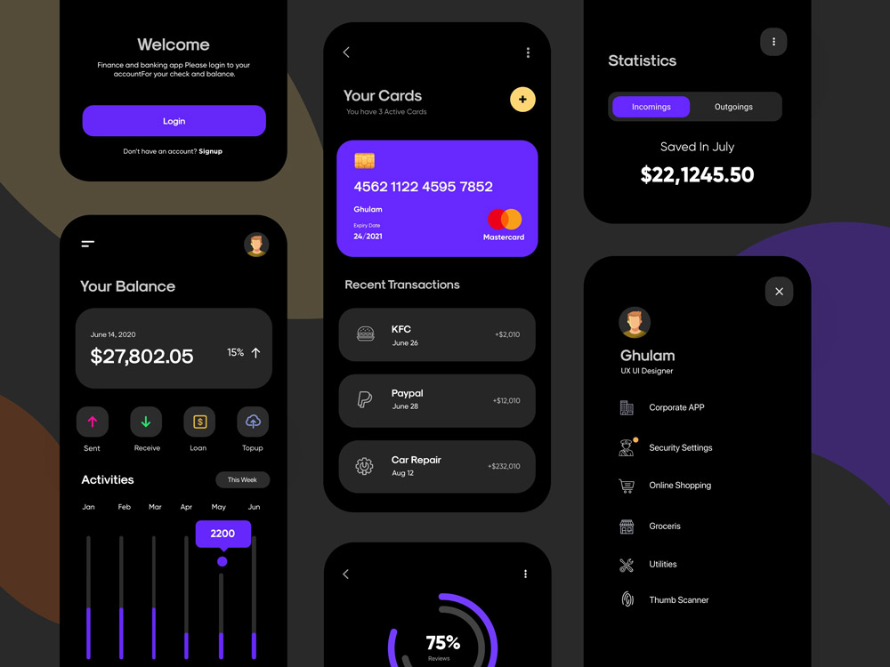
UI Elements and Components
A strong mobile app relies heavily on well-designed UI elements. These elements are the building blocks that shape the user experience, directly impacting how users interact with and perceive the application. Careful consideration of these components leads to intuitive and enjoyable interactions.
Understanding and utilizing common UI elements effectively is crucial for creating user-friendly apps. This section explores the significance of consistency, different element types, and the role of animations and interactivity in modern UI design.
Common UI Elements
A comprehensive list of UI elements is essential for effective mobile app design. These elements range from fundamental controls to intricate interactive components.
- Buttons: Buttons are fundamental for initiating actions. Different types of buttons, such as primary, secondary, and tertiary, communicate various levels of importance and action. For example, a “Submit” button is typically a primary button, while “Cancel” might be a secondary one. Visual cues like color and shape distinguish their functions.
- Input Fields: Input fields are essential for collecting user data. These fields come in various forms, such as text fields, number fields, date pickers, and more. Clear labels and placeholder text guide users in the data entry process. Appropriate validation ensures data integrity.
- Navigation Controls: Navigation controls facilitate movement within the app. These include tabs, navigation bars, and back buttons. These elements should be intuitively placed to allow users to easily explore different parts of the app.
- Sliders and Toggle Switches: These interactive elements are ideal for adjustable settings and on/off functionalities. Sliders allow for continuous adjustments, while toggle switches provide a simple binary choice.
- Lists and Grids: Used for displaying large amounts of data, lists and grids present items in an organized format. Proper structuring allows for quick scanning and selection.
- Images and Icons: Visual elements are crucial for conveying information and aesthetics. Images and icons add context and personality to the app. Appropriate sizing and resolution ensure high quality and responsiveness.
- Progress Bars and Loaders: These components keep users informed about the progress of operations. Visual progress indicators maintain user engagement, especially during lengthy tasks.
- Notifications: Notifications inform users about updates, messages, or events. Well-designed notifications provide context and encourage user engagement.
Consistency and Familiarity
Maintaining consistency in UI design across the entire app is paramount. Users develop familiarity with the layout and controls as they navigate through the app. This familiarity improves the user experience and reduces the learning curve.
Consistency in UI elements and interactions promotes ease of use and reduces user confusion.
Button Types
Various button types are used to indicate different actions. Primary buttons, often highlighted with a prominent color, are used for crucial actions. Secondary buttons are used for less critical actions. Tertiary buttons, usually smaller or less prominent, might perform auxiliary functions.
Input Fields
Input fields vary in their functionality and presentation. Text fields, number fields, date pickers, and more are designed for collecting different data types. Proper labeling and validation are critical for guiding the user and ensuring data integrity.
Navigation Controls
Navigation controls determine how users move through the app. These elements include tabs, navigation bars, back buttons, and more. Their placement and design must support easy and intuitive navigation, enhancing user flow.
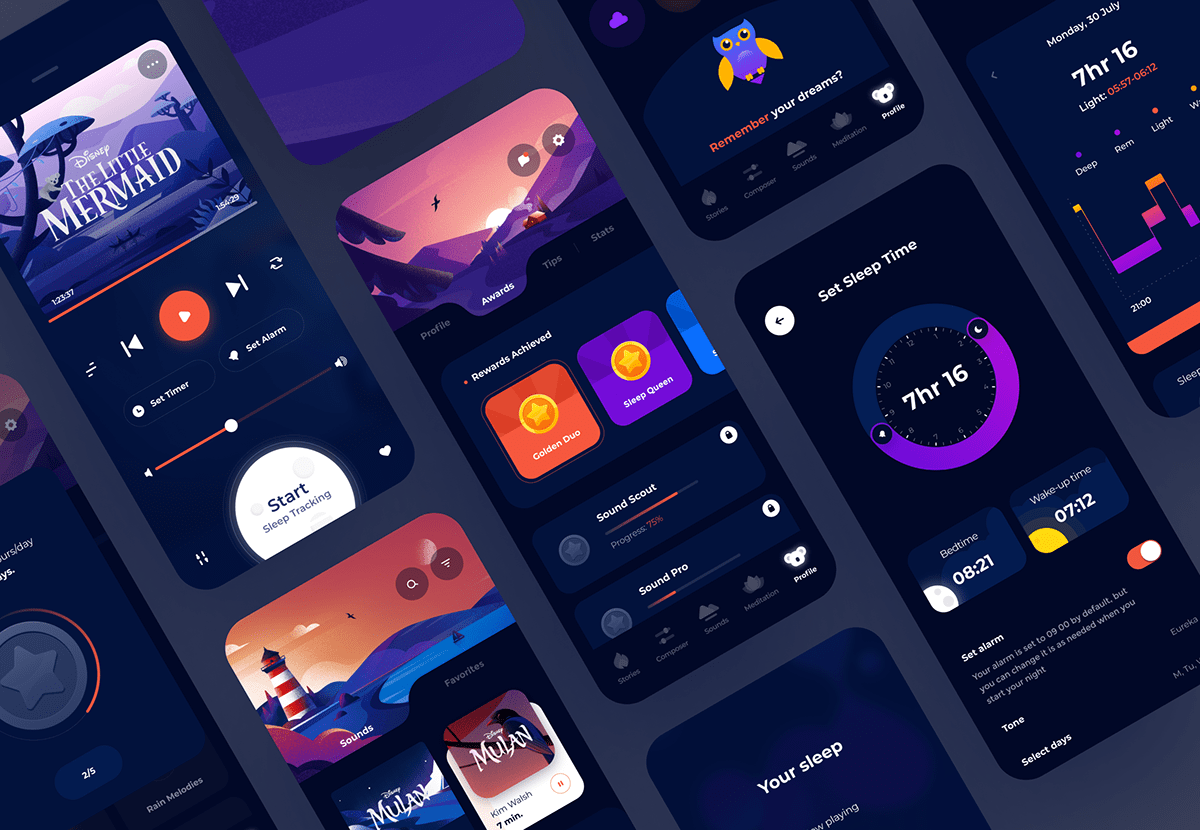
Animations and Transitions
Animations and transitions can significantly enhance user experience. They create visual cues and add to the perceived responsiveness of the app. Smooth transitions, for example, between screens or sections, are crucial to creating a polished user interface.
Interactive Elements
Interactive elements, such as buttons, input fields, and toggles, should respond promptly and predictably to user input. Feedback mechanisms, such as visual changes or auditory cues, inform users about the results of their actions. This responsiveness and feedback are key to a positive user experience.
Accessibility Considerations in UI Design
Creating accessible user interfaces is crucial for ensuring inclusivity and usability for all users, regardless of their abilities or disabilities. A well-designed accessible app caters to a broader user base, leading to increased user satisfaction and potentially higher adoption rates. Accessibility isn’t just about meeting legal requirements; it’s about creating a positive user experience for everyone.
Importance of Accessibility for Diverse Users
Accessibility in UI design encompasses a wide range of needs, including users with visual impairments, auditory impairments, motor impairments, cognitive impairments, and learning disabilities. Providing alternative text for images, captions for videos, and keyboard navigation options ensures that users with diverse needs can effectively interact with the application. These considerations also benefit users with temporary disabilities, such as injuries or situational limitations.
Accessibility Guidelines and Standards for App UI Design
Adherence to established accessibility guidelines and standards is essential for creating truly inclusive user interfaces. These guidelines often stem from organizations like the Web Content Accessibility Guidelines (WCAG) which provide a comprehensive framework for designing accessible web content, including mobile applications. Following these guidelines ensures that the application is usable by a wider range of users, promoting a more positive and equitable user experience.
Impact of Color Contrast, Text Size, and Keyboard Navigation on Accessibility
Color contrast plays a significant role in accessibility, especially for users with visual impairments. Sufficient contrast between text and background colors is vital for readability. Adequate text size is equally important, enabling users to easily read the content. Keyboard navigation allows users who cannot use a mouse or trackpad to interact with the application, ensuring that all interface elements are accessible through keyboard input.
Ways to Improve Accessibility in UI Elements
Implementing proper alt text for images, providing clear and concise labels for interactive elements, and offering diverse input methods, such as voice recognition, are essential for enhancing accessibility. Ensure that interactive elements, like buttons and links, have clear visual cues, like distinct borders or visual feedback.
Best Practices for Designing Accessible UI Elements
| Best Practice | Description |
|---|---|
| Use sufficient color contrast | Ensure that text and background colors have a sufficient contrast ratio to meet accessibility guidelines. Tools exist to verify contrast levels. |
| Provide clear labels for all interactive elements | Labels should clearly indicate the function of buttons, links, and other interactive components. |
| Use descriptive alternative text (alt text) for images | Alt text should accurately describe the content of the image to users who cannot see it. |
| Ensure keyboard navigation for all interactive elements | All interactive elements should be accessible via keyboard navigation. Focus indicators should clearly highlight active elements. |
| Provide diverse input methods | Offer options like voice input, screen readers, and other assistive technologies to cater to a broader range of users. |
| Use clear and concise language | Avoid jargon or overly complex language that could hinder understanding. |
| Implement proper heading structure | Structure content using appropriate heading tags (H1-H6) to improve readability and navigation. |
Design Tools and Techniques
App UI design relies heavily on effective tools and techniques. Choosing the right software and understanding the nuances of various approaches are crucial for producing a polished and user-friendly application. Different tools cater to various aspects of the design process, from initial sketching to final implementation. Mastering these tools and techniques empowers designers to efficiently create engaging and functional user interfaces.
The design process involves a range of tools and techniques, from low-fidelity wireframes to high-fidelity mockups. The selection of appropriate tools and techniques depends on the project’s specific needs and the designer’s skill set. This section delves into the landscape of these tools, highlighting their strengths and weaknesses.
Software Tools for UI Design
Various software tools facilitate the UI design process. Their capabilities vary, impacting design approach and efficiency.
- Figma: A popular collaborative design tool, Figma excels in its real-time collaboration features, allowing multiple designers to work simultaneously on the same project. Its robust vector-based graphics capabilities enable the creation of detailed and complex interfaces. It also supports prototyping and integrates well with other development tools.
- Adobe XD: Adobe XD is a user-friendly tool known for its intuitive interface. It facilitates the creation of interactive prototypes, providing designers with a platform to test and refine designs before development. Its strong integration with other Adobe Creative Suite applications is a significant benefit.
- Sketch: A powerful vector graphics editor, Sketch is highly valued for its efficiency in creating intricate and detailed designs. Its focus on vector graphics ensures high-resolution output suitable for production. It provides excellent control over design elements and facilitates collaboration through shared libraries and design systems.
- Balsamiq Mockups: Ideal for early-stage wireframing and rapid prototyping, Balsamiq Mockups enables quick creation of low-fidelity designs. Its simplicity and speed make it suitable for initial user feedback and iterative design cycles.
Comparison of Design Tools
Different design tools offer varying functionalities and capabilities. A comparison aids in choosing the most suitable tool for specific projects.
| Tool | Strengths | Weaknesses |
|---|---|---|
| Figma | Real-time collaboration, robust vector graphics, prototyping, integration with development tools | Can be complex for beginners, occasional performance issues |
| Adobe XD | User-friendly interface, interactive prototyping, integration with other Adobe applications | Limited vector graphics capabilities compared to Figma, not as robust for extremely complex projects |
| Sketch | Excellent vector graphics, high-resolution output, control over design elements, collaboration features | Steeper learning curve, limited support for collaborative features compared to Figma |
| Balsamiq Mockups | Rapid prototyping, low-fidelity designs, user-friendly interface, cost-effective | Limited detail capabilities, not suitable for complex designs, lacks advanced prototyping features |
Prototyping Tools and Functionalities
Prototyping tools facilitate the creation of interactive representations of app interfaces. Choosing the right tool depends on the desired level of interaction and complexity.
- In-built prototyping tools (e.g., Figma, Adobe XD): These tools provide built-in prototyping features, allowing designers to create interactive prototypes directly within the design software. This approach often simplifies the workflow and ensures consistency across the design and prototyping phases.
- Dedicated prototyping tools (e.g., InVision, Marvel): These tools focus solely on prototyping, providing specialized features for interactive design. They often offer advanced features for user interaction and testing, enabling more thorough evaluation of the user flow.
Utilizing Design Principles and Tools for Effective UI
Applying design principles within the context of chosen tools is essential. This approach enhances the user experience.
“Effective UI design integrates user-centered principles, leveraging appropriate tools to create intuitive and engaging interfaces.”
The workflow involves iterative design, feedback loops, and continuous refinement. The selection of appropriate tools directly impacts the effectiveness and efficiency of the design process. Thorough testing and validation at each stage are critical to the creation of a robust and successful app UI.
Responsive Design Considerations
Responsive design is crucial for modern app development, ensuring a seamless user experience across a wide range of devices and screen sizes. From smartphones to tablets to desktop computers, users expect your app to adapt and function optimally on their preferred platform. Ignoring responsive design can lead to a frustrating and unusable experience for a significant portion of your potential user base.
Adapting your UI elements for various devices and screen resolutions is paramount to a successful app. Different devices have distinct screen sizes and aspect ratios, which necessitate tailoring the presentation of UI elements for optimal visibility and interaction. This adaptability translates directly into a more user-friendly and engaging experience.
Importance of Different Screen Sizes
User experience varies drastically depending on the device. A mobile phone screen presents a different challenge compared to a desktop monitor. Optimizing for different screen sizes and resolutions is essential for maintaining a consistent and enjoyable user experience across platforms. Consider the physical dimensions and limitations of each device to ensure your app is visually appealing and functionally accessible on all screens.
Adapting UI Elements
Successfully adapting UI elements for various devices involves several key strategies. Elements like buttons, text fields, and images must be scaled appropriately to fit the screen. For example, excessively large buttons on a mobile device can be difficult to tap accurately, whereas small text on a desktop monitor can be hard to read. Careful consideration of these factors is crucial for a positive user experience.
Media Queries and Responsive Frameworks
Media queries are a powerful tool for adapting UI elements based on screen size and resolution. These CSS rules allow you to apply different styles to your elements based on the characteristics of the device. Using media queries allows for precise control over how your UI transforms, ensuring the app looks and functions correctly on various devices. Furthermore, responsive frameworks, like Bootstrap and Foundation, provide pre-built components and styles that can significantly streamline the process of creating responsive UIs.
Optimizing UI Elements for Different Screen Sizes
Optimizing UI elements for different screen sizes requires careful consideration of several factors. Font sizes, button sizes, and image dimensions must be adjusted to maintain readability and usability. For example, a button might need to be larger on a smaller screen to accommodate touch input, while text should be larger on a larger screen to maintain legibility. These adjustments contribute to the overall effectiveness and user experience of the app.
“Responsive design ensures that your app looks and feels great on any device, regardless of screen size or resolution. This improves user engagement and fosters a positive user experience, which is essential for app success.”
Case Studies and Examples
Examining successful app UI designs provides valuable insights into effective design principles and their impact on user experience. Analyzing various case studies allows us to identify common threads in successful implementations and learn from both successes and failures. Understanding how design choices contribute to app success can inform future design decisions.
Successful app UI design often stems from a deep understanding of the target user base and their needs. A well-designed UI seamlessly integrates functionality with an intuitive and aesthetically pleasing interface, encouraging user engagement and adoption. Examining specific examples can illustrate how different design elements contribute to a positive user experience.
Successful App UI Design Case Studies
Numerous apps have achieved significant user adoption and positive reviews due to thoughtful UI design. Understanding the design choices in these cases offers valuable learning opportunities. These examples highlight effective approaches to UI design and user experience.
Examples of Successful Apps and Their UI Design
- Instagram: Instagram’s UI prioritizes visual appeal and ease of use. Its intuitive grid-based layout for displaying photos and videos is highly effective. The use of visual cues, such as likes and comments, provides clear feedback to users. The consistent use of visual hierarchy and color palettes contributes to a seamless user experience. The app is very user-friendly and visually appealing.
- Spotify: Spotify’s UI excels in its organization and discoverability. The app’s intuitive navigation, categorized music libraries, and personalized recommendations create a seamless music discovery experience. Visual cues like album art and song information are presented in a clear and aesthetically pleasing manner. The UI’s design enhances user engagement and satisfaction, especially in the context of discovering new music.
- Netflix: Netflix’s UI focuses on ease of browsing and discovery. Its highly personalized recommendations and intuitive navigation make finding content effortless. The use of large, high-quality thumbnails and clear categorization of content contribute to the ease of use. The UI design is very successful in supporting the core functionality of the app, enabling users to easily find content and enjoy it.
Analysis of UI Design Choices and Their Impact
The success of these apps hinges on several design choices. For example, Instagram’s use of a grid layout maximizes the visual impact of images, while Spotify’s clear categorization helps users quickly find desired music. Netflix’s emphasis on personalization fosters user engagement and satisfaction. Each app effectively uses a different approach, highlighting the diversity of successful UI design strategies.
Comparison and Contrast of Similar Apps
Comparing similar apps can reveal insights into successful UI design approaches. For instance, music streaming apps like Apple Music and YouTube Music share some similarities with Spotify in terms of music discovery and organization but may have different UI elements for different user experiences. The differences in approach often stem from the target audience and specific app functionality.
UI Design Elements and Success Metrics
| Design Element | Success Metric (Example) |
|---|---|
| Instagram (Visual Appeal, Ease of Use) | High user engagement (high post frequency, high interaction rate) |
| Spotify (Organization, Discoverability) | High user retention (long-term use), high customer satisfaction (positive reviews) |
| Netflix (Ease of Browsing, Personalization) | High user engagement (time spent in the app), high customer satisfaction (positive reviews) |
Concluding Remarks

In conclusion, creating effective app UI design is a multifaceted process that requires a deep understanding of user needs and a solid grasp of design principles. By focusing on usability, accessibility, and a user-centered approach, developers can create compelling and successful mobile applications. This comprehensive guide provides a roadmap for anyone seeking to enhance their app UI design skills and produce user-centric interfaces.


